From the plugin settings, you can create, configure, duplicate and delete saved WooCommerce product sliders.
The settings are divided into sections:
- Saved sliders
- Action buttons
- General
- Appearance
- Products
- Content
- Carousel
- Shortcode
Saved sliders
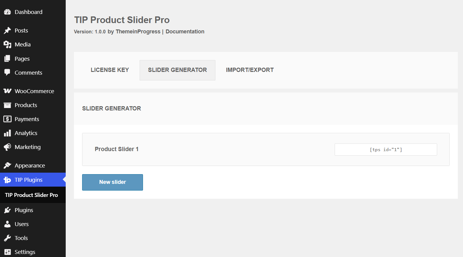
Slider list
What it does
Displays the list of saved product sliders created with the plugin.
When to use it
Use this screen to copy an existing shortcode, edit a saved slider, or create a new product slider.
Effect on the frontend
The frontend output depends on the saved configuration of each slider.
Important notes
Each saved slider has its own shortcode and can be inserted in multiple pages, posts, widgets, Gutenberg blocks or Elementor layouts.
New slider
What it does
Creates a new product slider configuration.
When to use it
Use it when you want to build a new WooCommerce product slider with a different layout, product query or carousel configuration.
Effect on the frontend
After saving, the plugin generates a shortcode that can be copied and pasted into the website.
Important notes
If the Pro license is not active, the slider generator controls may be locked.
Action buttons
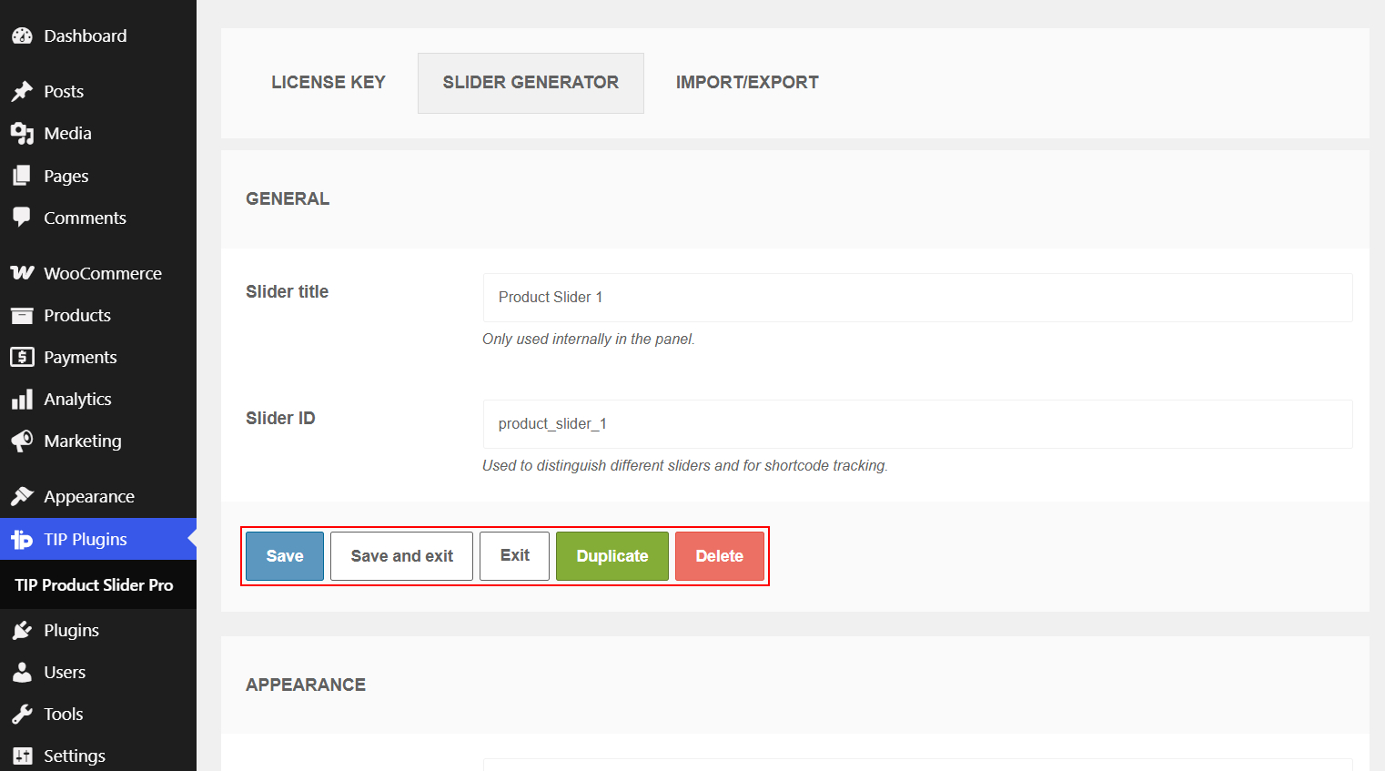
What they do
Allow you to save, exit, duplicate or delete the current slider.
Available actions:
- Save
- Save and exit
- Exit
- Duplicate
- Delete
When to use them
Use Save to store changes and continue editing. Use Save and exit to return to the slider list after saving. Use Duplicate to create a copy of the current slider. Use Delete to remove it.
Important notes
Deleting a slider also removes the saved configuration connected to its shortcode.
General
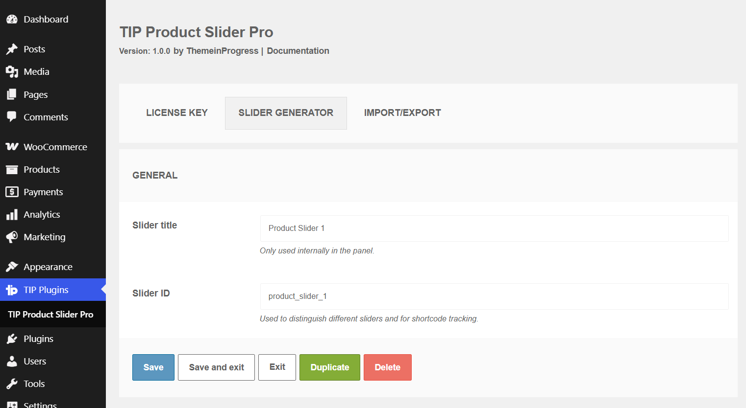
Slider title
What it does
Sets the internal name of the product slider.
When to use it
Use it to easily identify the slider in the admin area, for example Homepage featured products, Summer sale products, Best sellers, or New arrivals.
Effect on the frontend
The title is not automatically displayed on the website.
Important notes
It is used only for internal management inside the Slider Generator tab.
Slider ID
What it does
Identifies the saved slider and distinguishes it from other product sliders.
When to use it
Use a clear and stable ID, for example homepage_products, summer_sale, featured_slider, or new_arrivals.
Effect on the frontend
The plugin uses this value to identify the slider configuration connected to the generated shortcode.
Important notes
Do not change the Slider ID after publishing the slider unless you have a specific reason to reorganize the saved configuration.
Appearance
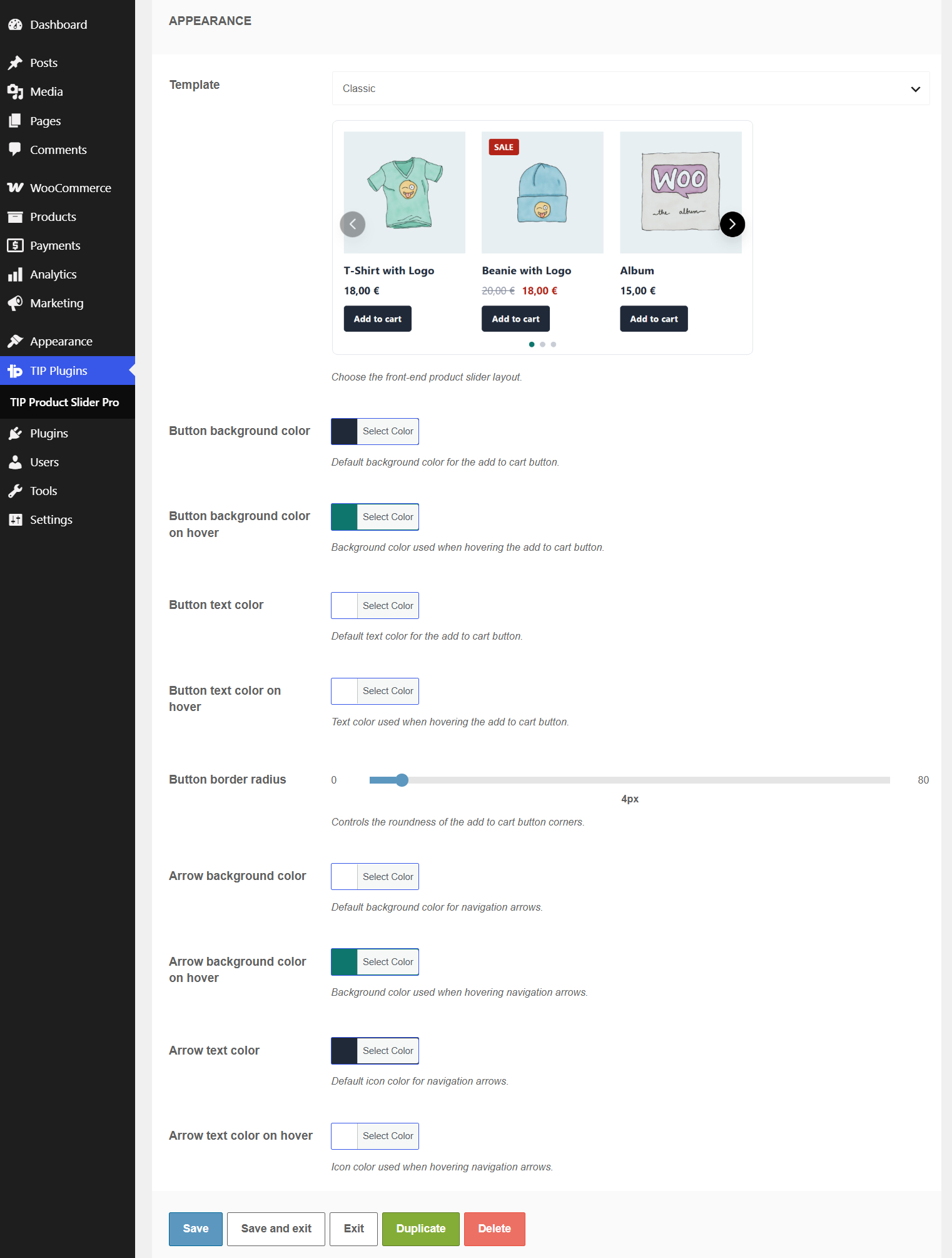
Template
What it does
Selects the visual layout of the product slider.
Available options:
- Classic
- Card
- Overlay
- Minimal
- Centered
- Compact
- Hero
When to use it
Use it to adapt the product slider to the design of the page.
Effect on the frontend
Changes the frontend template used to display product images, titles, prices, buttons and other product information.
Important notes
The template changes only the visual layout. It does not change which products are displayed.
Button background color
What it does
Sets the default background color of the add to cart button.
When to use it
Use it to match the button with the colors of your theme or landing page.
Effect on the frontend
Changes the normal background color of the add to cart button inside the product slider.
Important notes
Use a color that keeps the button clearly visible.
Button background color on hover
What it does
Sets the background color used when visitors hover the add to cart button.
When to use it
Use it to create a visual feedback effect when the button is hovered.
Effect on the frontend
The button background changes color on hover.
Button text color
What it does
Sets the default text color of the add to cart button.
When to use it
Use it to improve readability and contrast against the button background.
Effect on the frontend
Changes the text color of the add to cart button.
Button text color on hover
What it does
Sets the text color used when visitors hover the add to cart button.
When to use it
Use it together with the hover background color to keep the button readable.
Effect on the frontend
The button text changes color on hover.
Button border radius
What it does
Controls the roundness of the add to cart button corners.
When to use it
Use a low value for sharper buttons or a higher value for softer, rounded buttons.
Effect on the frontend
Changes the border radius of the add to cart button.
Important notes
The value is applied in pixels.
Arrow background color
What it does
Sets the default background color of the carousel navigation arrows.
When to use it
Use it to make the arrows visible on the slider background.
Effect on the frontend
Changes the normal background color of the previous and next arrows.
Arrow background color on hover
What it does
Sets the background color used when visitors hover the carousel arrows.
When to use it
Use it to create a clear hover state for the navigation controls.
Effect on the frontend
The arrow background changes color on hover.
Arrow text color
What it does
Sets the default icon color of the carousel arrows.
When to use it
Use it to improve contrast between the arrow icon and the arrow background.
Effect on the frontend
Changes the normal color of the previous and next arrow icons.
Arrow text color on hover
What it does
Sets the icon color used when visitors hover the carousel arrows.
When to use it
Use it together with the hover background color to keep the arrows readable.
Effect on the frontend
The arrow icon color changes on hover.
Products
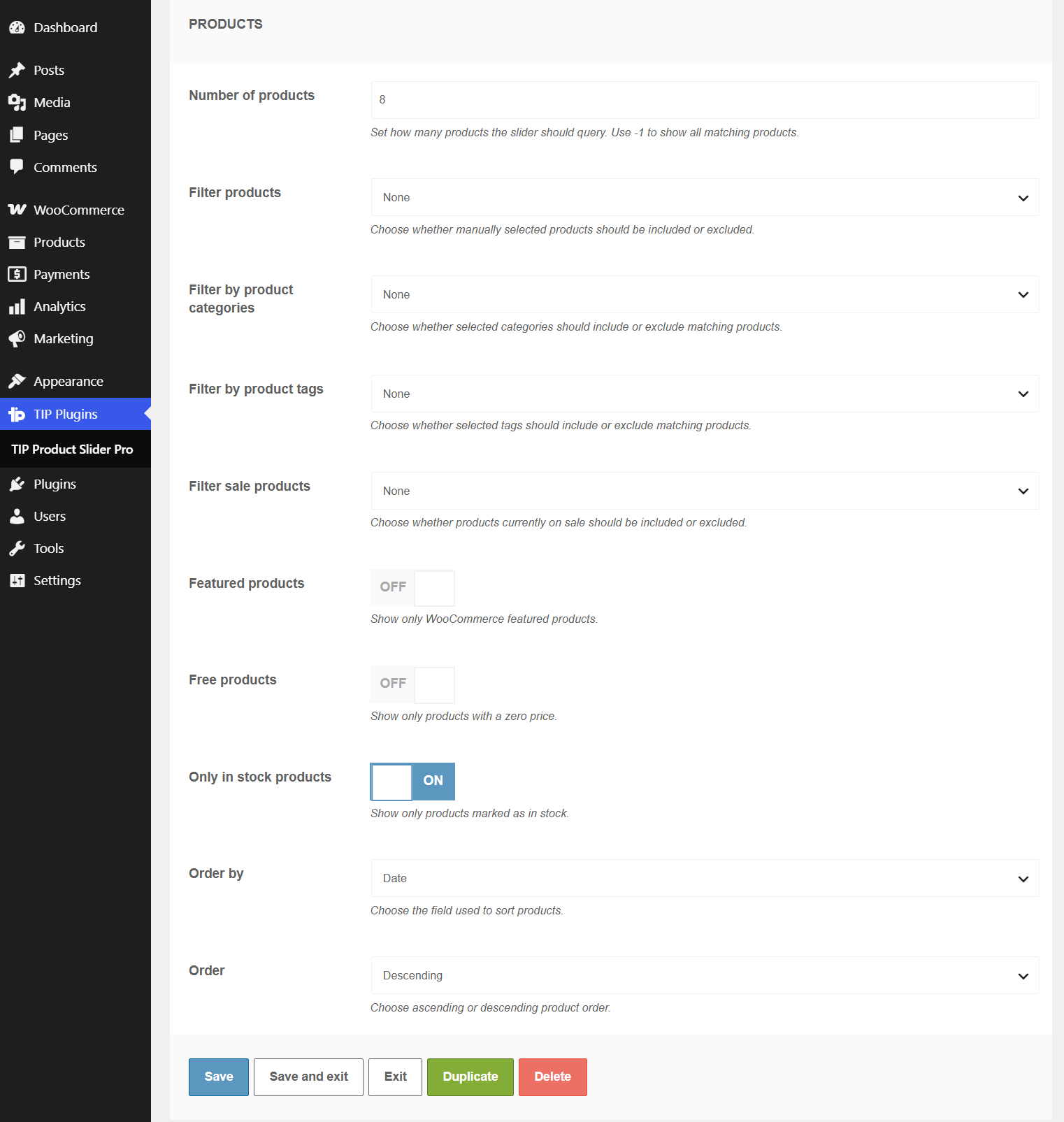
Number of products
What it does
Sets how many products the slider should query.
When to use it
Use it to limit the number of products displayed inside the carousel.
Effect on the frontend
The slider displays only the configured number of matching products.
Important notes
Use -1 to show all matching products. The accepted range is from -1 to 200.
Filter products
What it does
Defines whether manually selected products should be included or excluded.
Available options:
- None
- Include specific products
- Exclude specific products
When to use it
Use Include specific products to create a slider with selected products only. Use Exclude specific products to remove selected products from a broader product query.
Effect on the frontend
The product query is restricted according to the selected product filter mode.
Products to include
What it does
Selects the products that must be included in the slider.
When to use it
Use it when Filter products is set to Include specific products.
Effect on the frontend
Only the selected products are displayed.
Important notes
This field works only when the related include mode is selected.
Products to exclude
What it does
Selects the products that must be removed from the slider.
When to use it
Use it when Filter products is set to Exclude specific products.
Effect on the frontend
The selected products are not displayed in the slider.
Filter by product categories
What it does
Defines whether products from selected WooCommerce categories should be included or excluded.
Available options:
- None
- Include products from specific categories
- Exclude products from specific categories
When to use it
Use it to create sliders based on WooCommerce product categories.
Effect on the frontend
The product query follows the selected category rule.
Categories to include
What it does
Selects the WooCommerce product categories that must be included in the slider.
When to use it
Use it when Filter by product categories is set to Include products from specific categories.
Effect on the frontend
Only products from the selected categories are displayed.
Categories to exclude
What it does
Selects the WooCommerce product categories that must be removed from the slider.
When to use it
Use it when Filter by product categories is set to Exclude products from specific categories.
Effect on the frontend
Products from the selected categories are not displayed.
Filter by product tags
What it does
Defines whether products with selected WooCommerce tags should be included or excluded.
Available options:
- None
- Include products from specific tags
- Exclude products from specific tags
When to use it
Use it to create sliders based on WooCommerce product tags.
Effect on the frontend
The product query follows the selected tag rule.
Tags to include
What it does
Selects the WooCommerce product tags that must be included in the slider.
When to use it
Use it when Filter by product tags is set to Include products from specific tags.
Effect on the frontend
Only products with the selected tags are displayed.
Tags to exclude
What it does
Selects the WooCommerce product tags that must be removed from the slider.
When to use it
Use it when Filter by product tags is set to Exclude products from specific tags.
Effect on the frontend
Products with the selected tags are not displayed.
Filter sale products
What it does
Defines whether WooCommerce sale products should be included or excluded.
Available options:
- None
- Include sale products
- Exclude sale products
When to use it
Use Include sale products to display only discounted products. Use Exclude sale products to hide products currently on sale.
Effect on the frontend
The slider includes or excludes products based on their sale status.
Product filters
What they do
Apply additional product query filters.
Available options:
- Featured products
- Free products
- Only in stock products
When to use them
Use Featured products to show WooCommerce featured products only. Use Free products to show products with a zero price. Use Only in stock products to avoid displaying unavailable products.
Effect on the frontend
The slider displays only products that match the enabled filters.
Order by
What it does
Sets the field used to sort products.
Available options:
- Date
- Title
- Price
- Sales
- Rating
- Menu order
- Random
When to use it
Use it to control the order in which products appear inside the slider.
Effect on the frontend
Products are displayed according to the selected ordering method.
Order
What it does
Sets ascending or descending product order.
Available options:
- Descending
- Ascending
When to use it
Use it together with Order by to control the final product order.
Effect on the frontend
Changes the direction of the product sorting.
Content
Visible elements
What it does
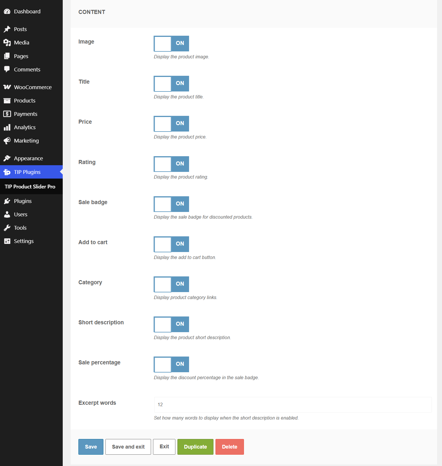
Controls which product information is visible inside each slide.
Available options:
- Image
- Title
- Price
- Rating
- Sale badge
- Add to cart
- Category
- Short description
- Sale percentage
When to use it
Use it to create a more detailed product card or a cleaner, minimal slider.
Effect on the frontend
Enabled elements are displayed inside each product slide. Disabled elements are hidden.
Important notes
Some elements depend on WooCommerce product data. For example, the sale badge is shown only for discounted products.
Excerpt words
What it does
Sets how many words are displayed from the product short description.
When to use it
Use it when Short description is enabled and you want to control the amount of text shown.
Effect on the frontend
The product short description is trimmed to the selected number of words.
Important notes
The accepted range is from 0 to 80.
Carousel
Desktop columns
What it does
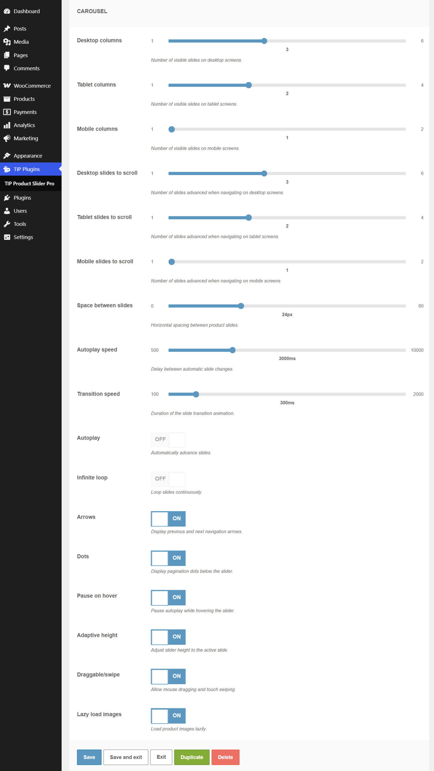
Sets the number of visible slides on desktop screens.
When to use it
Use it to control how many products are visible at the same time on large screens.
Effect on the frontend
The carousel displays the selected number of product columns on desktop.
Important notes
The accepted range is from 1 to 6.
Tablet columns
What it does
Sets the number of visible slides on tablet screens.
When to use it
Use it to optimize the slider layout for medium-width screens.
Effect on the frontend
The carousel displays the selected number of product columns on tablet.
Important notes
The accepted range is from 1 to 4.
Mobile columns
What it does
Sets the number of visible slides on mobile screens.
When to use it
Use it to keep the slider readable on small screens.
Effect on the frontend
The carousel displays the selected number of product columns on mobile.
Important notes
The accepted range is from 1 to 2.
Desktop slides to scroll
What it does
Sets how many slides advance when navigating on desktop screens.
When to use it
Use it to decide whether the carousel should move one product at a time or multiple products at once.
Effect on the frontend
The carousel advances by the selected number of products on desktop.
Important notes
The accepted range is from 1 to 6.
Tablet slides to scroll
What it does
Sets how many slides advance when navigating on tablet screens.
When to use it
Use it to adapt carousel navigation to tablet layouts.
Effect on the frontend
The carousel advances by the selected number of products on tablet.
Important notes
The accepted range is from 1 to 4.
Mobile slides to scroll
What it does
Sets how many slides advance when navigating on mobile screens.
When to use it
Use it to keep navigation simple on smaller screens.
Effect on the frontend
The carousel advances by the selected number of products on mobile.
Important notes
The accepted range is from 1 to 2.
Space between slides
What it does
Sets the horizontal spacing between product slides.
When to use it
Use it to make the slider more compact or more spacious.
Effect on the frontend
Increases or decreases the gap between products in the carousel.
Important notes
The value is applied in pixels. The accepted range is from 0 to 80.
Autoplay speed
What it does
Sets the delay between automatic slide changes.
When to use it
Use it when Autoplay is enabled and you want to control how frequently the slider moves.
Effect on the frontend
The carousel waits for the selected amount of time before moving to the next slide automatically.
Important notes
The value is applied in milliseconds. The accepted range is from 500 to 10000.
Transition speed
What it does
Sets the duration of the slide transition animation.
When to use it
Use it to make the carousel animation faster or slower.
Effect on the frontend
Controls how long the slide movement animation takes.
Important notes
The value is applied in milliseconds. The accepted range is from 100 to 2000.
Carousel options
What they do
Control the behavior and navigation of the product carousel.
Available options:
- Autoplay
- Infinite loop
- Arrows
- Dots
- Pause on hover
- Adaptive height
- Draggable/swipe
- Lazy load images
When to use them
Use these options to enable automatic movement, navigation controls, touch interaction and image loading optimization.
Effect on the frontend
The carousel behavior changes according to the enabled options.
Important notes
Autoplay speed has an effect only when Autoplay is enabled. Pause on hover is useful when Autoplay is active.
Shortcode
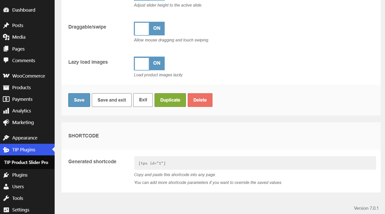
Generated shortcode
What it does
Shows the shortcode to copy and paste into the website.
Example:
[tps id="1"]
When to use it
Use it after configuring and saving the product slider.
Effect on the frontend
The plugin displays the saved product slider connected to the selected shortcode ID.
Important notes
You can insert the same shortcode on multiple pages. You can also add shortcode parameters manually if you want to override the saved values for a specific placement.